Scientific Infographic Maker
Use the scientific infographic maker to organize one question, its evidence path and a bounded takeaway. Build hierarchy and source notes without fabricating data or citations.
SEE ACADRAW IN ACTION
Science drawing, from idea to editable figure
Create a science illustration with AI. Refine drawings, build editable diagrams, and convert images to SVG.
Demos play as you scroll into view. Choose a feature to explore.
Trusted by students & researchers from 480+ universities
A global community spanning 60+ countries and regions, from QS top-ranked universities to leading research institutes
























University logos belong to their respective institutions and are shown solely to illustrate our user community. They do not imply any partnership or endorsement.
Tool overview
Explore the use cases, workflow, and key things to know.
Define the purpose
State whether the figure explains a setup, process, interpretation or reporting boundary.
Label the convention
Explain what each arrow, line, color or control means.
Review the limits
Keep generated visuals separate from real measurements and source files.
Concept reference
One question, one evidence path
A one-question infographic with Context, Evidence and Takeaway blocks plus a source/date/scope strip. It illustrates hierarchy and does not contain fabricated statistics.
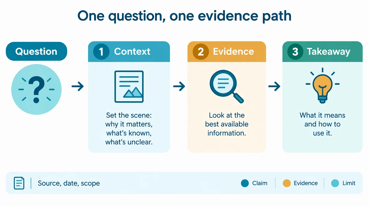
Scientific Infographic Maker: reference key
Use the reference and definitions together. On a small screen, scroll the table horizontally.
| Element | Meaning | Review check |
|---|---|---|
| Question | The problem the visual answers | State population, context and scope. |
| Context | Why the question matters | Keep background separate from evidence. |
| Evidence | The observation or source supporting a claim | Cite the source and its limits. |
| Takeaway | A bounded interpretation | Do not exceed what the evidence supports. |
| Source strip | Reference, date and scope | Make provenance visible in the layout. |
| Limit | What the visual cannot establish | Use plain language rather than a hidden disclaimer. |
Scientific Infographic Maker: plan the content
A scientific infographic succeeds when a reader can tell what is being asked, what supports the answer and where the claim stops. Structure is part of the evidence communication.
Start with the purpose of the scientific infographic
A useful scientific infographic begins with one question. Decide whether the visual should explain setup, process order, interpretation or a reporting boundary. A crowded diagram can contain accurate icons and still fail if the reader cannot tell what to notice first. The reference image is deliberately bounded. It uses labels and arrows to organize a teaching explanation, not to substitute for a protocol, a result file or a validated device. Write the scope in the caption before adding detail.
Separate the visual convention from the claim
Colors, line weights and arrows help a reader follow a scientific infographic, but they do not automatically represent measured magnitude or certainty. Define what an arrow means and state when a panel is illustrative. If the figure includes a control, label what decision that control supports. This distinction matters when a familiar visual resembles a result. A band, test line, gate, signal or property label can look authoritative even when it is only a teaching placeholder. Preserve that boundary in the legend and surrounding text.
Keep provenance and review visible
Before sharing a scientific infographic, compare every label with a reliable source and the actual question. Record the source image, method context, assumptions and edits. If the topic involves an assay or material, keep experimental observations in their own record rather than filling gaps with a plausible generated visual. A concise reference key makes review easier. It tells collaborators which terms are structural, which are process events and which are interpretations. That key is often more valuable than adding another decorative arrow.
Common mistakes in a scientific infographic
Separate the visual convention from the claim
Colors, line weights and arrows help a reader follow a scientific infographic, but they do not automatically represent measured magnitude or certainty. Define what an arrow means and state when a panel is illustrative. If the figure includes a control, label what decision that control supports. This distinction matters when a familiar visual resembles a result. A band, test line, gate, signal or property label can look authoritative even when it is only a teaching placeholder. Preserve that boundary in the legend and surrounding text.
Keep provenance and review visible
Before sharing a scientific infographic, compare every label with a reliable source and the actual question. Record the source image, method context, assumptions and edits. If the topic involves an assay or material, keep experimental observations in their own record rather than filling gaps with a plausible generated visual. A concise reference key makes review easier. It tells collaborators which terms are structural, which are process events and which are interpretations. That key is often more valuable than adding another decorative arrow.
Use the draft as a reviewable starting point
The scientific infographic tool helps turn a brief into a visual draft. It cannot decide whether a sample is valid, whether a mechanism is complete or whether a conclusion follows from a measurement. Ask a domain reviewer to check the final figure when the visual will guide an experiment, publication or health decision. Export the figure with a caption that names the scope and limits. Keep real data, source files and calculation records linked to the final version. A transparent workflow lets readers understand what the image explains and what it leaves unanswered.
Scientific Infographic Maker: from brief to reviewed draft
Reading the reference is free. Generating a new draft requires an account and available credits. See current pricing.
Choose Science Drawing for an illustrated draft, or Editable Diagram for separate shapes and labels. Review all definitions, labels and connections before sharing.
- 1
Write a bounded brief
Describe the scope, participants and visual conventions needed for this figure.
- 2
Generate a structured draft
Choose an illustrated or editable layout, then keep labels and arrows explicit.
- 3
Review before sharing
Compare the result with the source, method or design record and revise unsupported claims.
Example brief for a scientific infographic
Original scientific infographic design reference, white 1280x720 landscape, clean editorial vector style, readable English labels. Title 'One question, one evidence path'. Show a left-to-right hierarchy: 'Question' at top left, then three numbered blocks 'Context', 'Evidence', 'Takeaway' connected by simple arrows. Add a bottom source strip labeled 'Source, date, scope' and a small key 'Claim / Evidence / Limit'. Use teal blue amber accents, generous whitespace, no statistics, no fake citations, no medical advice, no logos, no copied artwork. Render all exact labels and arrows directly.
Use this prompt in the generatorScientific Infographic Maker: common questions
What does the scientific infographic tool create?
It creates an educational draft from your description. It does not infer real measurements or validate an experiment.
Can the example be used as experimental evidence?
No. The reference is a simplified teaching schematic. Real results require the original method, controls and data.
What should I review before sharing?
Check labels, directions, scope and the source-specific details in the scientific infographic figure.
Does it support real data analysis?
No. This page is for qualitative visual explanation and editable drafting, not computation from a data table.
Sources and editorial notes
Prepared by the AcaDraw product team. Source and diagram check: . This is a simplified educational model; independent expert review has not been completed. AI-generated drafts need checking against reliable references.
Read the scientific infographic guide
A scientific infographic succeeds when a reader can tell what is being asked, what supports the answer and where the claim stops. Structure is part of the evidence communication.
Scientific Infographics: Hierarchy, Evidence, and Captions