Org Chart Maker
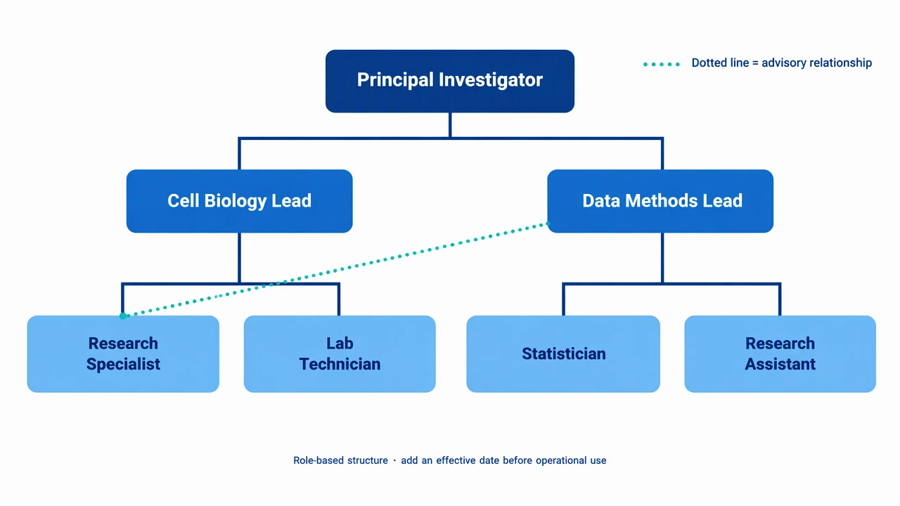
Create an org chart maker draft with roles, reporting lines and team groupings. Keep the structure current and explain dotted-line relationships. Use a focused scope, review labels and connections, and keep the reference qualitative.
SEE ACADRAW IN ACTION
Science drawing, from idea to editable figure
Create a science illustration with AI. Refine drawings, build editable diagrams, and convert images to SVG.
Demos play as you scroll into view. Choose a feature to explore.
Trusted by students & researchers from 480+ universities
A global community spanning 60+ countries and regions, from QS top-ranked universities to leading research institutes
























University logos belong to their respective institutions and are shown solely to illustrate our user community. They do not imply any partnership or endorsement.
Tool overview
Explore the use cases, workflow, and key things to know.
Define the scope
Choose the view, audience and labels before generating.
Keep relationships explicit
Use readable arrows, connectors or boundaries instead of decorative ambiguity.
Review before sharing
Check spelling, endpoints and claims against reliable references.
Concept reference
Org Chart Maker reference: clear labels and relationships
Create an org chart maker draft with roles, reporting lines and team groupings. Keep the structure current and explain dotted-line relationships. The original teaching illustration is schematic and does not encode measured data or guarantee factual correctness.
Compare and Contrast reference key
Use the reference and definitions together. On a small screen, scroll the table horizontally.
| Label or stage | Position or relationship | Meaning and drawing check |
|---|---|---|
| Topic A | Left region | Features unique to the first concept, structure or process. |
| Topic B | Right region | Features unique to the second concept, structure or process. |
| Shared features | Overlap | Properties that genuinely apply to both topics. |
| Evidence note | Optional caption or footer | Add a source or definition when the comparison depends on a specific classification. |
Build a comparison that readers can scan
A useful organizer states the comparison question first, then keeps unique and shared properties in consistent regions.
Scope controls meaning
A focused view is easier to read when the audience and intended lesson are explicit.
Labels need endpoints
Place each label next to the structure, role or relationship it describes.
Qualitative by default
This reference does not calculate or display a real dataset.
Common compare and contrast mistakes
Overloading the page
Keep secondary details in an inset or a separate figure.
Leaving relationships implicit
Label lines and boundaries so readers can follow the intended meaning.
Treating a draft as verified
Review AI-generated text and structure before publishing.
Create your own org chart maker diagram
Reading the reference is free. Generating a new draft requires an account and available credits. See current pricing.
Choose Science Drawing for an illustrated draft, or Editable Diagram for separate shapes and labels. Review all definitions, labels and connections before sharing.
- 1
Set the comparison question
Name the two topics and the criterion that connects them.
- 2
Draft the regions
Place unique and shared points in separate editable text areas.
- 3
Check the logic
Remove items that do not belong to either topic or the intersection.
A prompt you can adapt
Create a clean, editable educational org chart maker with short readable labels, generous spacing and explicit relationships. Keep the model qualitative, avoid invented measurements, and add a small scope note.
Use this prompt in the generatorOrg Chart Maker diagram FAQ
What is a compare and contrast graphic organizer?
It is a visual template for listing features unique to two topics and features they share.
What goes in the overlap?
Only properties that apply to both topics belong in the overlap.
Can the circles represent percentages?
This template is qualitative. Use a data visualization tool when circle size or counts carry numerical meaning.
Can I compare scientific concepts?
Yes. Define the comparison criterion and cite a source when the categories are technical.
Sources and editorial notes
Prepared by the AcaDraw product team. Source and diagram check: . This is a simplified educational model; independent expert review has not been completed. AI-generated drafts need checking against reliable references.
Create a org chart maker diagram for your lesson
Choose the scope, generate a draft, then review labels and connections before sharing.
Org Chart Maker: Roles, Reporting Lines & Teams